PT
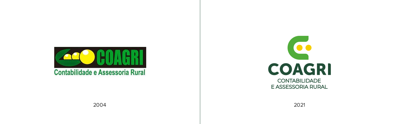
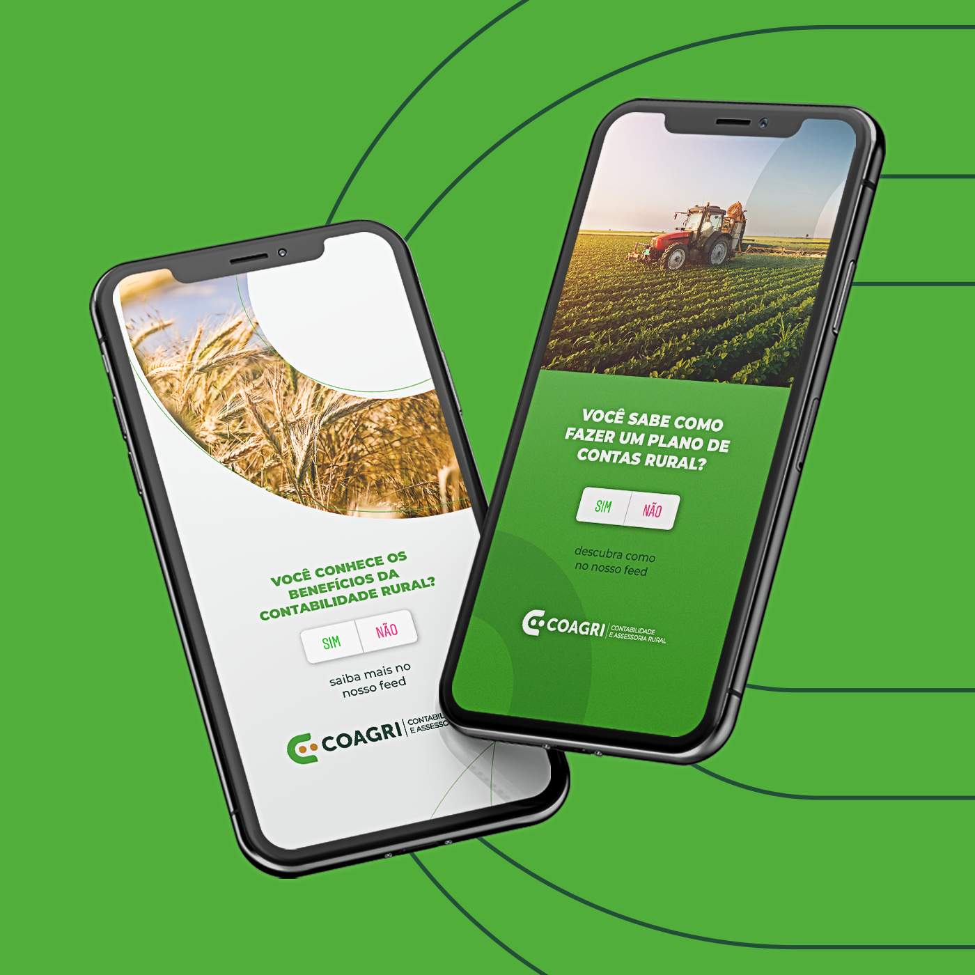
Formada em 2004 a Coagri surgiu a partir da paixão pela área contábil. Hoje a empresa é especializada em contabilidade e assessoria rural. Durante esses 17 anos percebeu-se a necessidade de modernizar a marca, buscando uma nova proposta de identidade visual com o objetivo de expansão e melhoria de negócios.
EN
Formed in 2004, COAGRI emerged from the passion for the accounting area. Today the company specializes in rural accounting and advisory. During these 17 years, the need to modernize the brand was perceived, seeking a new visual identity proposal with the objective of expanding and improving the business.

PT
Foram desenvolvidos inúmeros rascunhos e ideias que conseguissem transmitir o segmento de atuação da Coagri (contabilidade e assessoria rural) e durante esse processo, chegamos em um resultado que fez referência as caraterísticas da antiga marca, que já era consolidada em sua região, Silvânia/GO.
EN
Numerous drafts and ideas were developed that could convey COAGRI's operating segment (accounting and rural advisory) and during this process, we reached a result that made reference to the characteristics of the old brand, which was already consolidated in its region, Silvânia - Goiás, Brazil.

PT
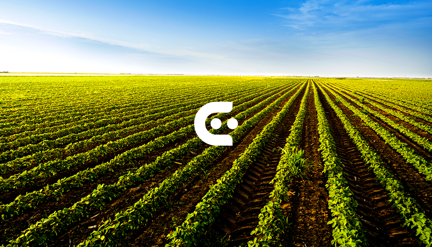
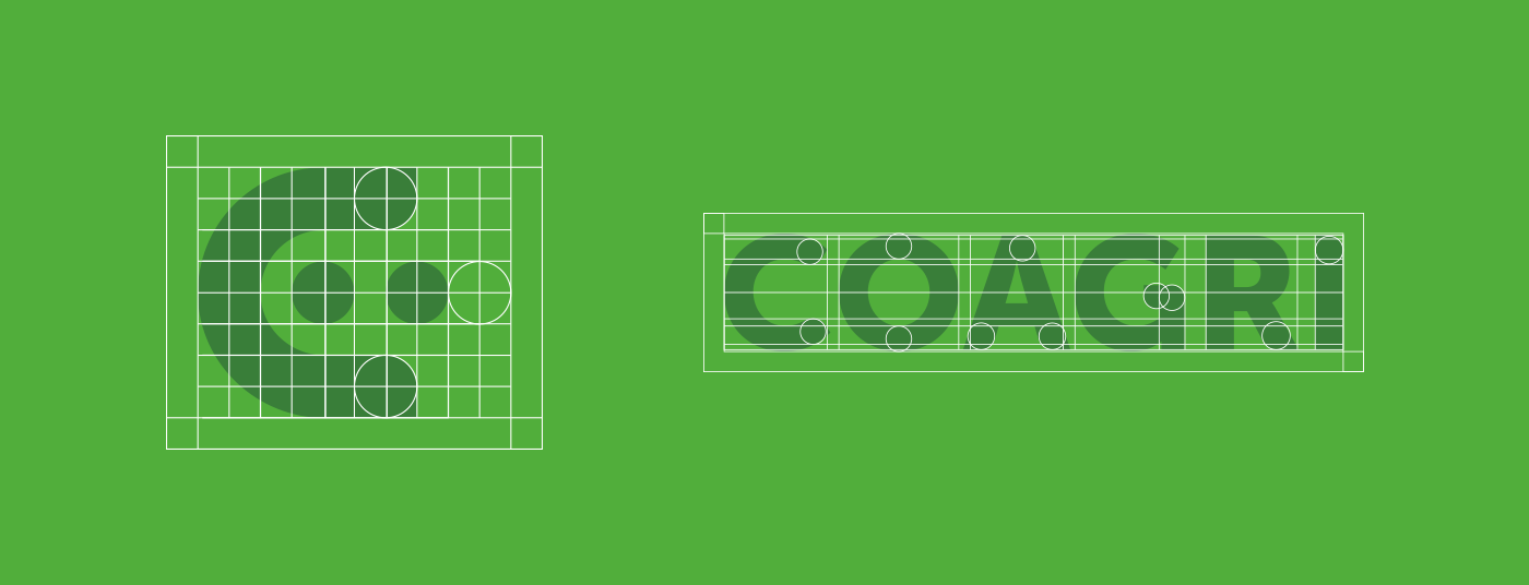
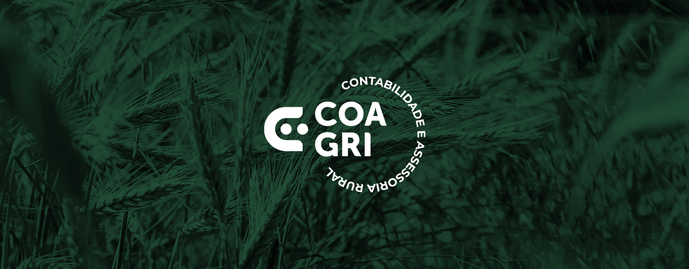
A maior inspiração para a construção do ícone foi a letra C de COAGRI. Desenvolvendo uma analogia a agricultura, que é um dos setores de maior atuação da empresa.
O mote primordial para a criação do símbolo da COAGRI foi o resgate da essência. Uma empresa que possui uma trajetória desde 2004 tem muito para contar, por isso, o símbolo resgata e desenvolve características da marca antiga.
EN
The biggest inspiration for the construction of the icon was the letter C of COAGRI, developing an analogy to agriculture, which is one of the company's most active sectors.
The primordial motto for the creation of the COAGRI symbol was the rescue of its essence. A company that has a trajectory since 2004 has a lot to tell, that's why the symbol rescues and develops characteristics of the old brand.
PT
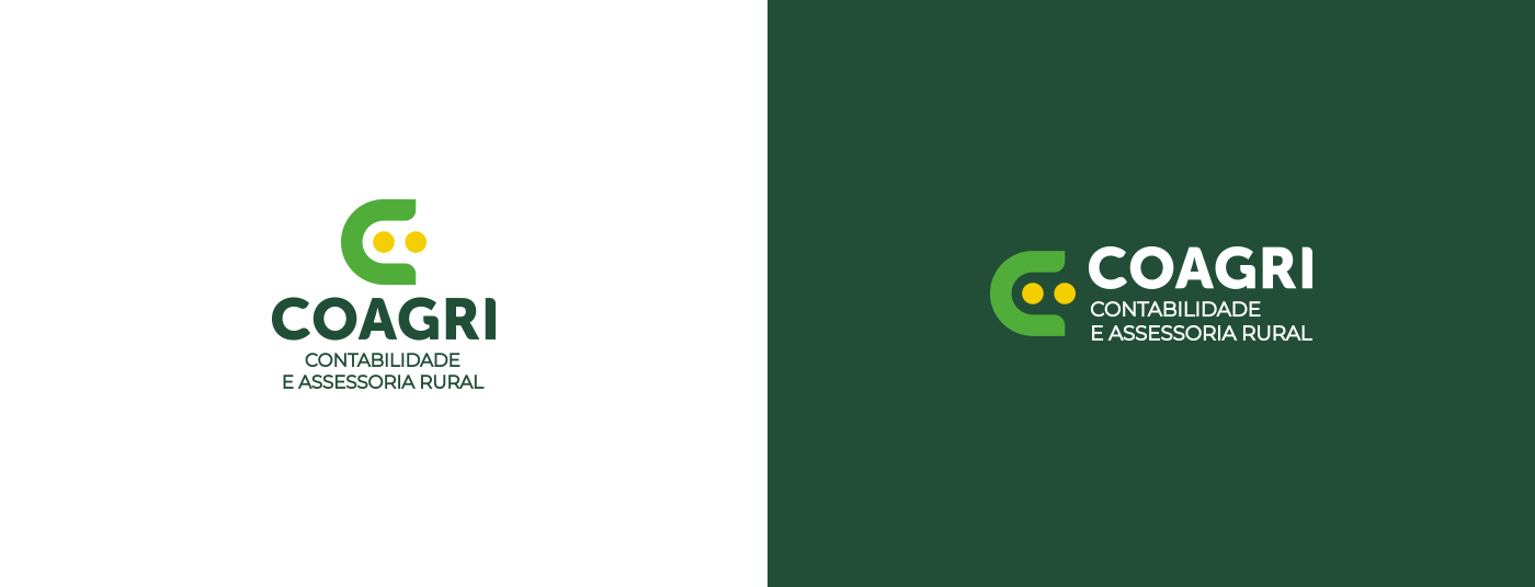
A construção do ícone foi com base em um grid modular. O uso do grid auxilia nas escolhas simétricas mantendo uma relação proporcional entre os elementos. O mesmo se aplica a tipográfica, que teve a grossura do “o” como padrão de curvatura da tipografia.
EN
The construction of the icon was based on a modular grid. The use of the grid helps in symmetric choices, maintaining a proportional relationship between elements. The same applies to typography, which had the thickness of the “o” as the typography's curvature pattern.
PT
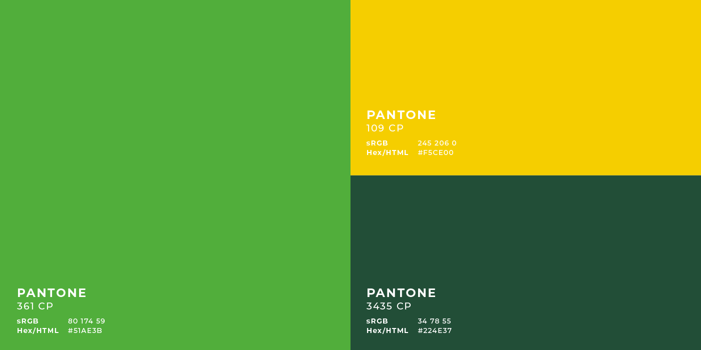
Em busca de uma paleta harmônica, que transmitisse diretamente a preferência e segmento de atuação da COAGRI, foram determinadas 3 cores principais e análogas.
O verde está diretamente ligado a natureza transmitindo crescimento. Essa cor conta com duas tonalidades: o tom mais claro que se apresenta pacífico e receptivo, exalando confiança. E o verde mais escuro que mantém a marca reservada e profissional.
O amarelo foi escolhido pelo sentimento de otimismo, além de, apresentar ligação direta com a semente e o sol. Essa cor carrega fortes sentimentos de prosperidade
EN
In search of a harmonic palette, which would directly transmit COAGRI's preference and segment of activity, 3 main and analogous colors were determined.
Green is directly linked to nature transmitting growth. This color has two shades: the lightest shade that is peaceful and receptive, exuding confidence; Darker green keeps the brand reserved and professional.
Yellow was chosen for the feeling of optimism, in addition to being directly linked to the seed and the sun. This color carries strong feelings of prosperity.


Brand Identity Project COAGRI Contabilidade e Assessoria Rural
-
-
Client: COAGRI
Images: Adobe Stock
Art and Criative Director: Luiz Curado
Motion Graphics: Luiz Curado | Overblur Studio
Motion Consulter: Sérgio silva
Texts: Amanda Bruna Alves Ferreira | Luiz Curado
English Translation Proofreader: Luiza Arêdes
www.overblur.com | @luiz.motion
Images: Adobe Stock
Art and Criative Director: Luiz Curado
Motion Graphics: Luiz Curado | Overblur Studio
Motion Consulter: Sérgio silva
Texts: Amanda Bruna Alves Ferreira | Luiz Curado
English Translation Proofreader: Luiza Arêdes
www.overblur.com | @luiz.motion